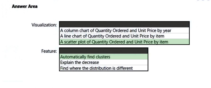
HOTSPOT -
You have a dataset named Pens that contains the following columns:
✑ Item
✑ Unit Price
✑ Quantity Ordered
You need to create a visualization that shows the relationship between Unit Price and Quantity Ordered. The solution must highlight orders that have a similar unit price and ordered quantity.
Which type of visualization and which feature should you use? To answer, select the appropriate options in the answer area.
NOTE: Each correct selection is worth one point.
Hot Area: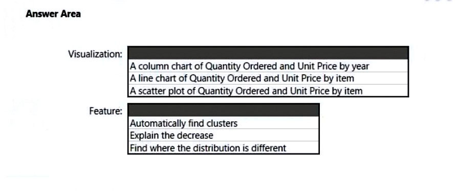

PaweuG
Highly Voted 2 years, 2 months agoLanTodak
Highly Voted 1 year, 6 months agorcaliandro
Most Recent 8 months, 1 week ago0e18c76
11 months, 3 weeks agoyordiye
2 years, 3 months agoyordiye
2 years, 3 months agolukelin08
2 years, 4 months agoBooster21
2 years, 6 months agoClodia
2 years, 6 months ago