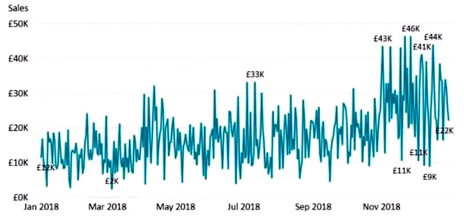
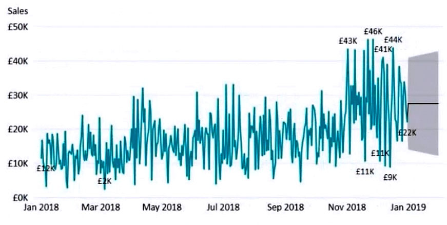
You have the visual shown in the Original exhibit. (Click the Original tab.) You need to configure the visual as shown in the Modified exhibit. (Click the Modified tab.) What should you add to the visual?
Since we are expanding the visual with future dates (that's my assumption although it's not explicitely stated), we should add forecast.
I think to use a measure to add that additional period, we should use it in the dataset with a calculated column filling in the new dates with that measure keeping the rest of originl values.
An average line and trenline would be drawn across the visual for all the dates not just in the expanded period
That's actually tricky. It clearly looks like a forecast. However a forecast wouldn't forecast a flat line but ups and downs. Flat line is what the trend or the average would look like here.
This section is not available anymore. Please use the main Exam Page.PL-300 Exam Questions
Log in to ExamTopics
Sign in:
Community vote distribution
A (35%)
C (25%)
B (20%)
Other
Most Voted
A voting comment increases the vote count for the chosen answer by one.
Upvoting a comment with a selected answer will also increase the vote count towards that answer by one.
So if you see a comment that you already agree with, you can upvote it instead of posting a new comment.

INDEAVR
Highly Voted 2 years, 6 months agoMoxieTT
Highly Voted 1 year, 9 months agojaume
Most Recent 5 months, 1 week agorcaliandro
8 months, 1 week agob7c21a9
1 year, 1 month agoStressFree
1 year, 4 months agobingomutant
1 year, 6 months agoMEG_Florida
1 year, 8 months agoShalaleh
1 year, 11 months agoDanylessoucis
2 years, 3 months agolukelin08
2 years, 4 months agoNamenick10
2 years, 5 months agoClodia
2 years, 6 months ago