DRAG DROP -
A company is implementing Power BI to track sales.
Each of the company's regions has specific quarterly and yearly sales goals.
You need to build a Power BI dashboard for various reporting requirements.
Which chart types should you use? To answer, drag the appropriate chart types to the correct requirements. Each chart type may be used once, more than once, or not at all. You may need to drag the split bar between panes or scroll to view content.
NOTE: Each correct selection is worth one point.
Select and Place: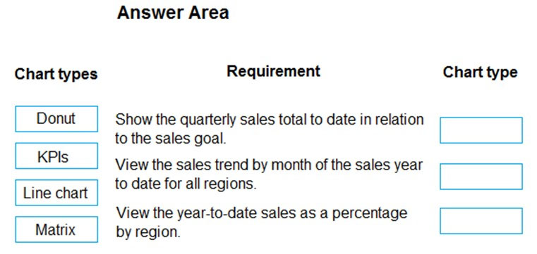


Samay30
Highly Voted 1 year, 11 months agoAnetaK
Highly Voted 1 year, 10 months agosemauni
8 months, 2 weeks agoEdrisKazemi
Most Recent 1 year, 3 months agortth
1 year, 3 months agoleojadue
1 year, 4 months ago