Suggested Answer:
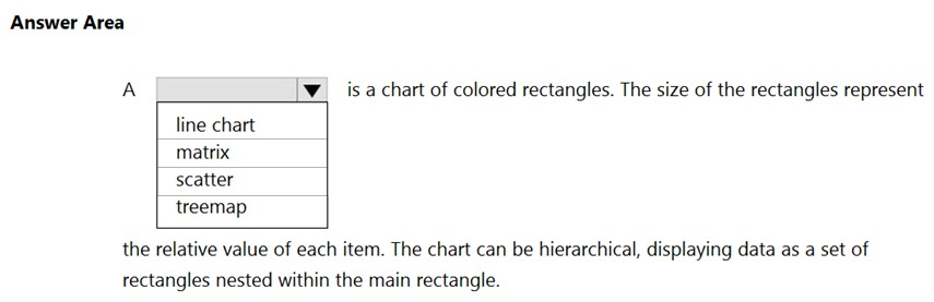
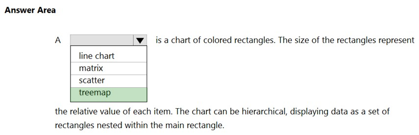
A treemap chart divides the chart area into rectangles that represent the different levels and relative sizes of the data hierarchy. Reference: https://docs.microsoft.com/en-us/sql/reporting-services/report-design/tree-map-and-sunburst-charts-in-reporting-services?view=sql-server-ver15
A treemap is a chart of colored rectangles where the size of each rectangle represents the relative value of each item. It can also display hierarchical data, with rectangles nested within larger ones to represent different levels of the hierarchy.
No. C is a Scatter Plot which is used to analyze what happens to a variable when another variable changes, consist of many dots on the chart. Treemap consists of coloured rectangles.
This section is not available anymore. Please use the main Exam Page.DP-900 Exam Questions
Log in to ExamTopics
Sign in:
Community vote distribution
A (35%)
C (25%)
B (20%)
Other
Most Voted
A voting comment increases the vote count for the chosen answer by one.
Upvoting a comment with a selected answer will also increase the vote count towards that answer by one.
So if you see a comment that you already agree with, you can upvote it instead of posting a new comment.

bfan95
Highly Voted 2 years, 6 months agomamahani
Highly Voted 1 year, 6 months agoman5484
Most Recent 3 months, 1 week agoheobanten04
6 months, 4 weeks agoAGTraining
8 months agoBXtheCoder
9 months agojames2033
1 year agoHRKK
1 year, 3 months agochiiiweiii
1 year, 7 months agojharnakalan
1 year, 8 months agoBXtheCoder
9 months agoAlex4190
1 year, 8 months agoblackskies
2 years agogabrisiq
2 years, 2 months agoEltooth
2 years, 3 months agoWWDITDA
2 years, 4 months agoManoj6
2 years, 5 months agodk87
2 years, 5 months ago