Welcome to ExamTopics
ExamTopics Logo
- Expert Verified, Online, Free.
exam questions

Exam DA-100 All Questions

View all questions & answers for the DA-100 exam

Exam DA-100 topic 4 question 1 discussion

Actual exam question from Microsoft's DA-100
Question #: 1
Topic #: 4
[All DA-100 Questions]

DRAG DROP -
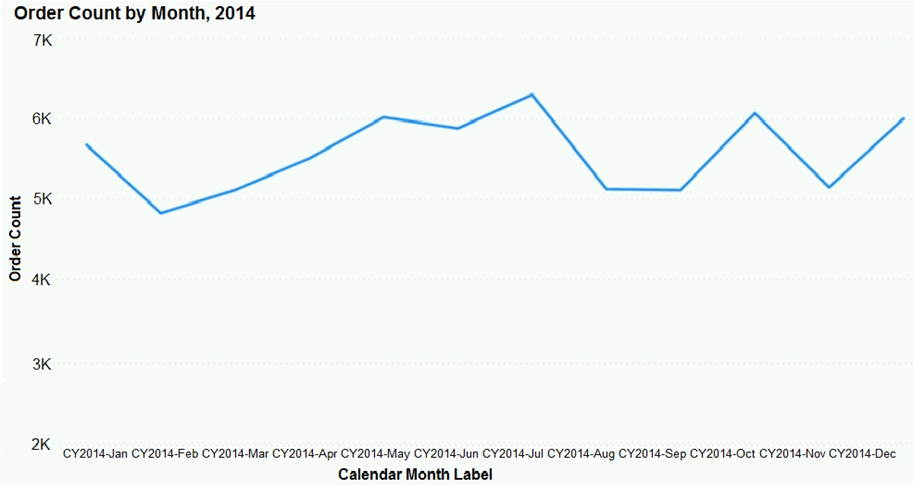
You have the line chart shown in the exhibit. (Click the Exhibit tab.)
You need to modify the chart to meet the following requirements:
✑ Identify months that have order counts above the mean.
✑ Display the mean monthly order count.
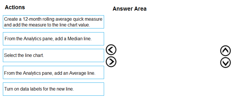
Which three actions should you perform in sequence? To answer, move the appropriate actions from the list of actions to the answer area and arrange them in the correct order.
Select and Place:
Show Suggested Answer Hide Answer
Suggested Answer:
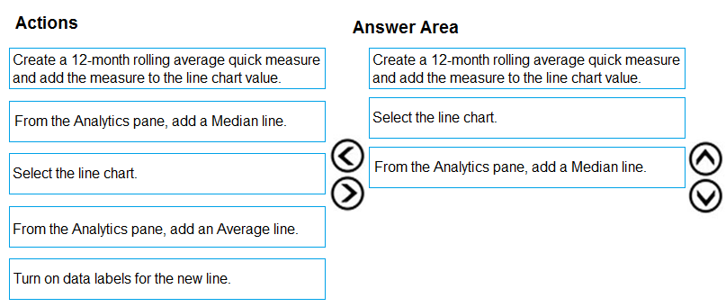
Step 1: Create a 12-month...
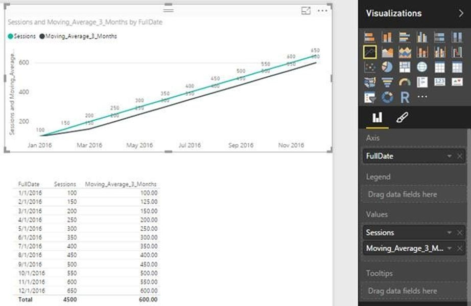
You can use calculated measure to get the expected result.
1. Create a calculated column for the date.
2. Create a measure for 12 months moving average.
3. Drag the Line Chart into your canvas as below. (step 2 below)


Step 2: Select the line chart -
Step 3: From the Analytics pane, add a Median line
Reference:
https://community.powerbi.com/t5/Desktop/Moving-Average/td-p/43041

Comments

Chosen Answer:
This is a voting comment (?) , you can switch to a simple comment.
Switch to a voting comment New
titi08
Highly Voted 4 years ago
My Ans:- 1. Select the line chart 2. Add the average line 3. Turn on Data Label
upvoted 342 times
berserkguts
3 years, 3 months ago
9 months later, this still holds true (tested it locally)
upvoted 7 times
...
AntoanT
3 years, 11 months ago
Mean = Average. Mean is NOT Median ;)
upvoted 15 times
...
Zakriya
3 years, 6 months ago
correct
upvoted 1 times
...
Geyper
3 years ago
Does the aggregation has anything to do with this? Doing the average line over that line wouldn't take the daily average and not the monthly? I assume doing the 12 moths rolling means you take the monthly value as source for the new monthly average line. Or is it the same?
upvoted 1 times
...
...
VR1
Highly Voted 4 years, 1 month ago
My Ans:- 1. Select the line chart 2. Add the Median line 3. Turn on Data Label ( Display the mean monthly order count)
upvoted 35 times
Lhouss
3 years, 10 months ago
Be careful, Median is not the mean/average
upvoted 37 times
...
pmkamleshpartin
3 years, 6 months ago
Median not mean
upvoted 4 times
...
MaQya
3 years, 3 months ago
how is this highly voted
upvoted 16 times
...
YTYTYTYTYT
2 years, 11 months ago
median not equal to mean
upvoted 3 times
...
...
emp207
Most Recent 2 years, 2 months ago
WHY select Line Chart its already line chart. Add average line for 1st requirement. 12month roll avg and add labels for new line for 2nd requirement. THATS IT! khaby lame style.
upvoted 1 times
...
QWERTYman
2 years, 3 months ago
1. Select the line chart 2. Add average line 3. Turn on Data labels
upvoted 1 times
...
anbianci
2 years, 3 months ago
yes confirm 1. Select the line chart 2. Add the average line 3. Turn on Data Label
upvoted 3 times
...
anurag49
2 years, 4 months ago
The right order of answere would be: 1.Create 12 month moving average 2.Turn on the data lable for new line. 3. From the analytics pane ,add an average line.
upvoted 3 times
...
Mad0701
2 years, 5 months ago
Create a measure for 12 months moving average. Select the line chart From the Analytics pane, add a Median line
upvoted 2 times
...
Shan
2 years, 10 months ago
In exam 30/12/21
upvoted 1 times
...
sofiaapedro
2 years, 11 months ago
What’s the correct answer?
upvoted 1 times
...
adbukavu
2 years, 11 months ago
A measure will give a single value? I think there is typo it should have been turn on data labels for the line (not the new line)
upvoted 1 times
...
toaldoe
2 years, 11 months ago
My Ans:- 1. Select the line chart 2. Add the average line 3. Turn on Data Label
upvoted 2 times
...
Prathameshsable
3 years, 3 months ago
Correct Ans is Create 12 month rolling avg, select line chart, display data labels. There is one important point that we forget here, the question asks to display monthly across every month on the line chart. Adding a average line will just display average line data label and not monthly, so that option wont work.
upvoted 9 times
...
patricepic
3 years, 3 months ago
Requirement is "Display Monthly Mean" . Mean equals Average but Monthly Average does not equal Rolling Monthly Average.
upvoted 4 times
...
SillyChili
3 years, 4 months ago
what does the "Select the line chart" even mean or do? Am I the only one who don't get the answer?
upvoted 1 times
Vulkany
3 years, 2 months ago
If you don´t select the Line Chart visual you do not have Analytics options available
upvoted 2 times
...
...
JoJoJa
3 years, 4 months ago
So what is the answer if this comes in the exam? 1. Select 2. Average line 3. Data label?
upvoted 1 times
...
BilJon
3 years, 4 months ago
When testing, if first creating and adding 12 months rolling average the chart is already selected, then add the average line and turn data labels on for the line. But if the option was given I'd add the data labels for the chart at first, then the avg line and data labels for it
upvoted 1 times
...
Daneas
3 years, 4 months ago
select create turn on label one the new line
upvoted 1 times
...
Community vote distribution
A (35%)
C (25%)
B (20%)
Other
Most Voted
A voting comment increases the vote count for the chosen answer by one.

Upvoting a comment with a selected answer will also increase the vote count towards that answer by one. So if you see a comment that you already agree with, you can upvote it instead of posting a new comment.

SaveCancel
Loading ...